Modern Church Connection Cards Examples (With Template)
Connecting with new visitors is crucial for churches today. However, traditional connect cards with extra form fields can deter visitors from providing their information.
In this post, I'll create a fresh, new connect card design that converts more visitors into contacts.
And when it comes to visitor card design, the #1 rule is this:
The more form fields you display on a connect card, the fewer cards you'll have filled out.
Studies by Barna Group found that Millennials are only willing to provide limited information like their first name. Roughly half are comfortable giving their last name. And only 30% are okay with providing their email address.
Tough stats.
In a similar study, it was also shown that across generations, younger people are more protective of their personal details.
That said, the days of the double-sided connect card being most effective are in the past. We need a new approach.
Introducing the modern church connection card template I’m sharing with you today.
Free Bonus: Connect Card Template
Click the button below to download a full series of print-ready connect card templates.
Download Print-Ready Templates

The New Connect Card Design
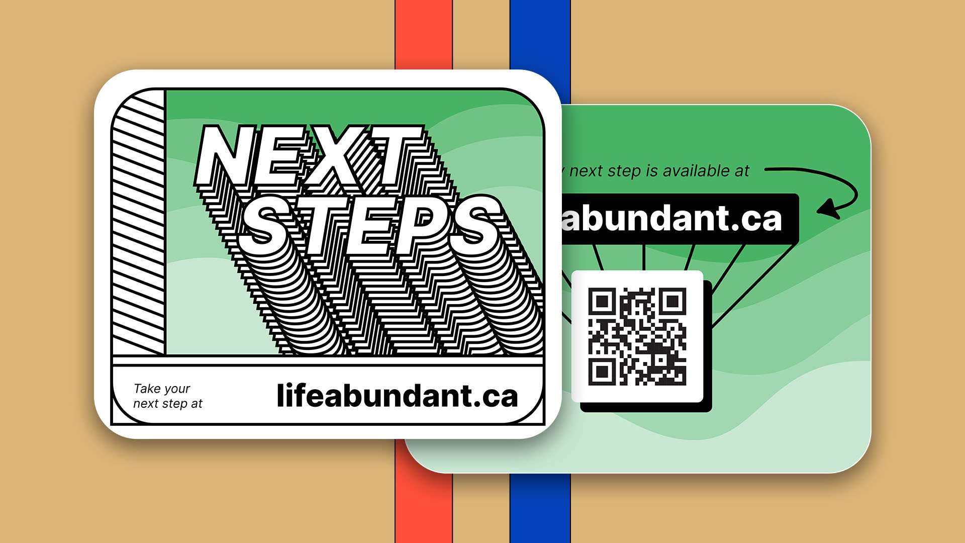
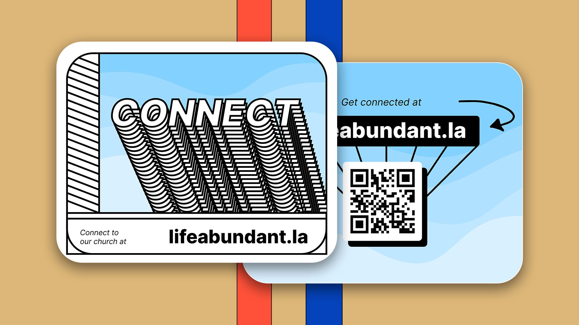
Here's what the new connect card looks like:
It's shaped like a postcard instead of a flyer to project friendliness over promotion.
The color-coding is also essential, which I'll explain more briefly.
And instead of using insider church jargon like "connect card,” the call to action is simply:
"Pick up the blue card and scan the QR code on the back."
QR codes have become the industry standard post-world pandemic. All smartphones now have the capability, directly in their cameras, to scan QR codes within seconds.
It's a quick, easy way for visitors to engage.
“Pick up the blue card and scan the QR code on the back.”
Key Difference: New vs. Traditional Connect Card
The most crucial difference between the new and traditional designs is the first thing you ask the visitor to do.
With a traditional card, you ask the visitor to fill out…well, the entire card as the first step. That's a giant leap to make all at once.
Your visitors will probably spend more time reviewing the fields and wondering why you need all this information rather than just filling it out. The new card breaks it into smaller steps:
Visitor ➔ Scan QR Code ➔ Fill Out Form ➔ Submit Card
The Big Idea: This mirrors a more human approach of asking for information one piece at a time. And it's proven more effective—forms that ask one question at a time convert 36% better.
Why These Details Matter
Some of you may wonder why I’m so adamant about spending so much time perfecting a "silly connect card."
It's because once you've done the hard work of getting a new visitor to your church, it’s massively important that you capture their information so you can connect them to pastoral care and community.
Every detail in this process contributes to that goal.
Like a preacher pours over every word of a sermon, as church communicators, we pour over every detail of things like this because we know it can make an eternal difference.
How to Customize the New Connect Card Template
As I mentioned, I’ve provided a template for you for free. So, let's walk through customizing this new connect card template for your church.
Step 1: Download the Template
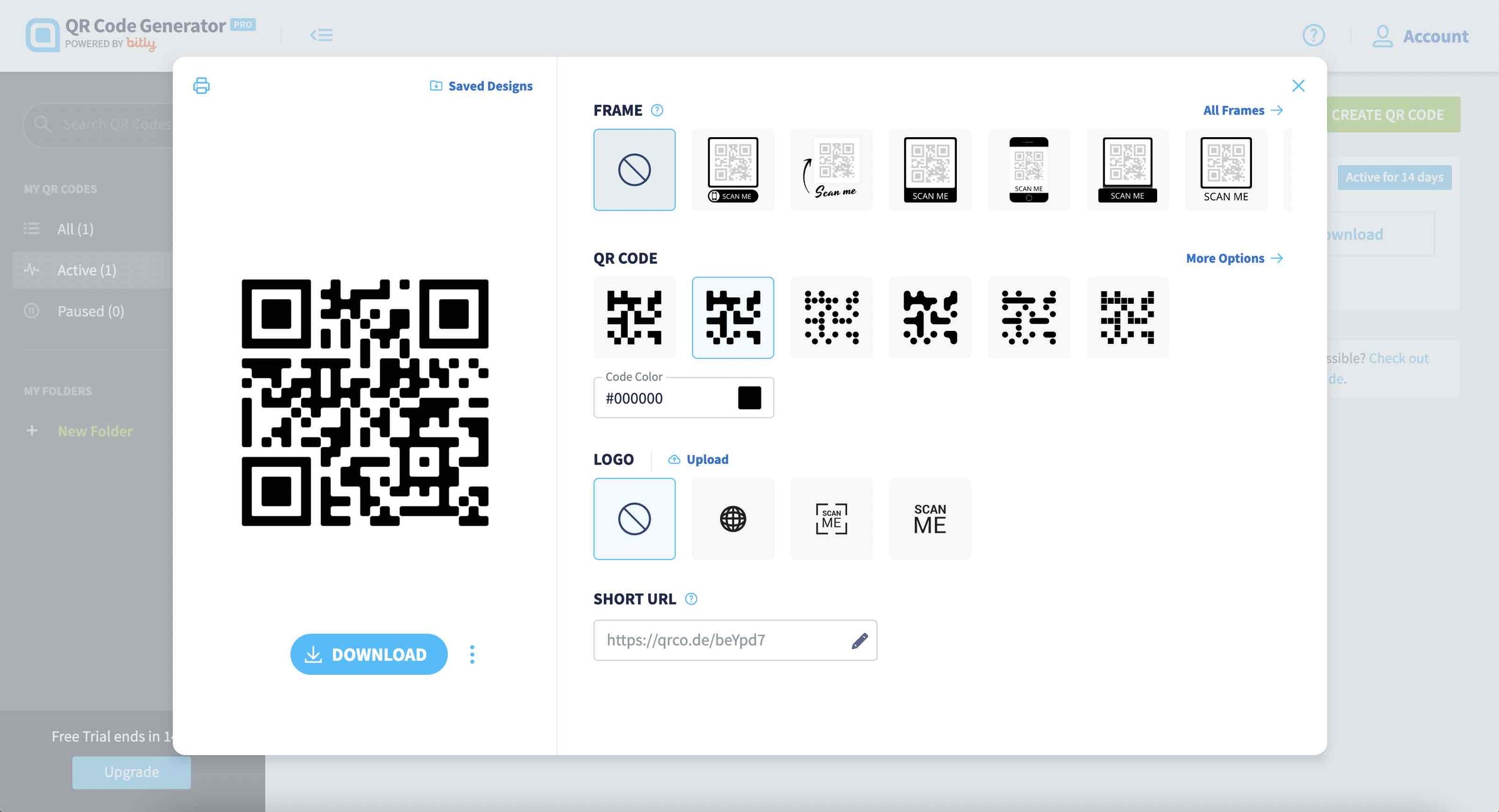
Step 2: Generate a QR Code
I use a site like qr-code-generator.com.
If you choose this option, you’ll need to sign up for free before you can generate your QR code in a print-ready format.
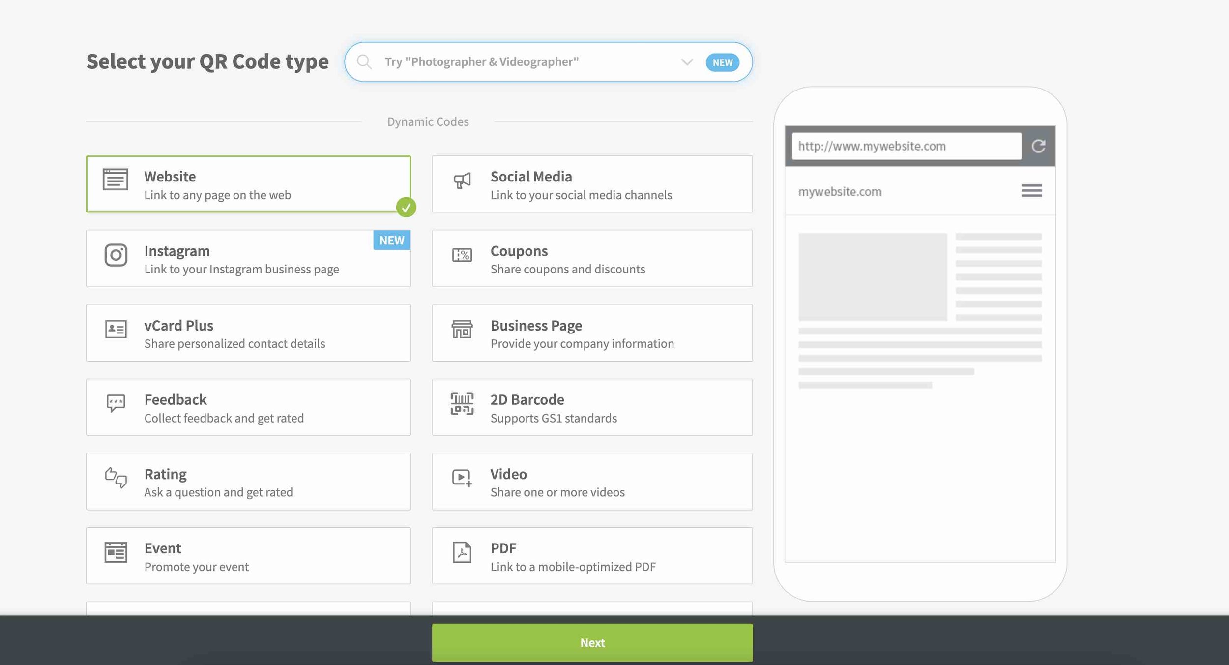
Once you’ve signed up, you can go ahead and select “Website” for the QR code type. Click “Next.”
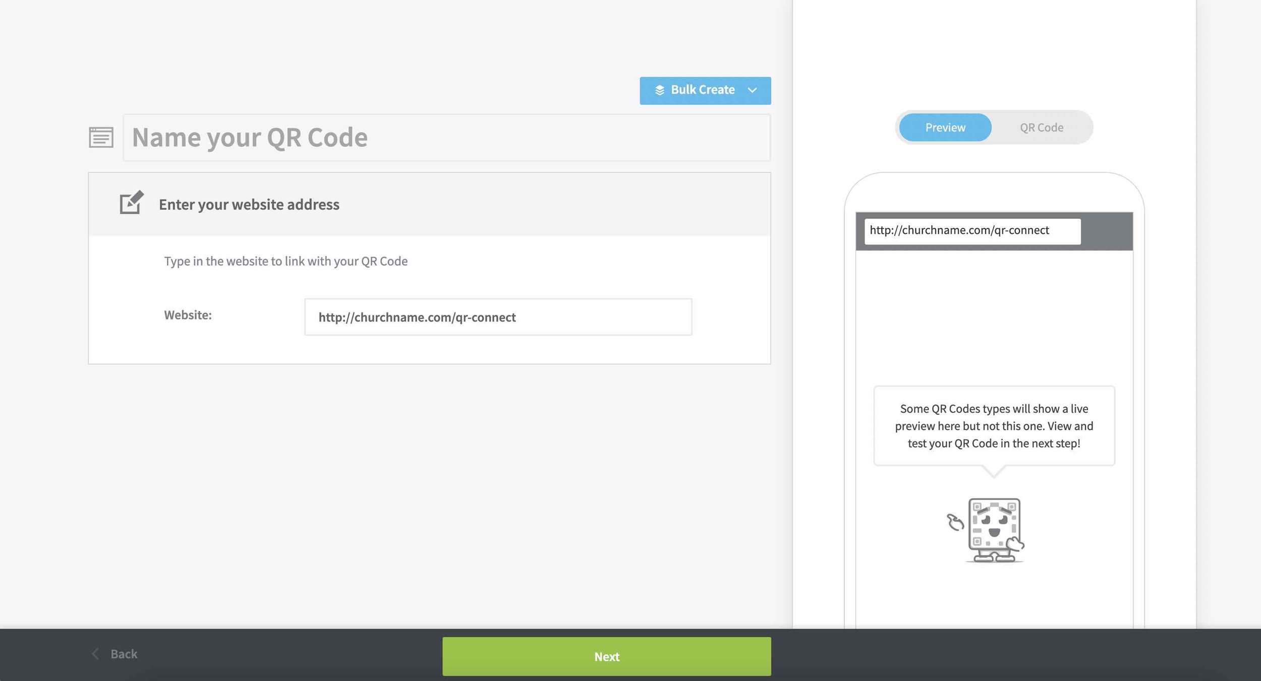
Then, enter your custom URL and click “Next.”
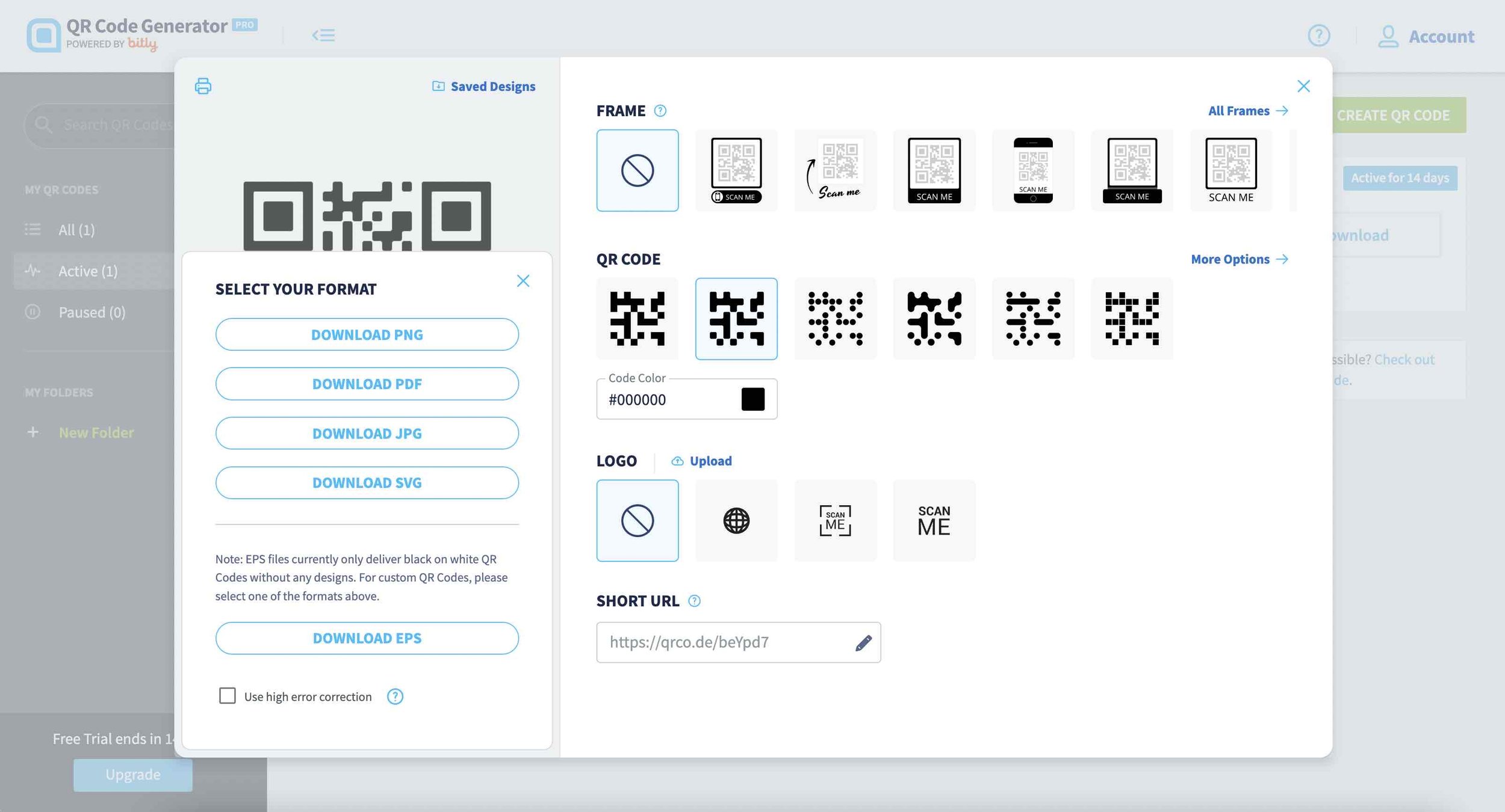
Choose “No frame” and then click the three dots to the right of “Download.”
Select “Download EPS” to give you a print-quality file version.
Bonus Tips: Instead of using the final URL, use a redirect URL that links to the destination page.
For example: Use churchname.com/qr-connect instead of the actual destination page churchname.com/connectwithus.
This way, if there’s ever a need to change the destination URL, you can do so at any time without having to reprint cards because all you need to do is update the redirect link.
Step 3: Edit the Template
Using Adobe Illustrator, edit the template's colors to match your church's brand.
Replace the website URL with your church's domain.
Insert your QR code in the designated space.
And you're done! The card is ready for printing.
Combining Your Connect Card With Slides On Screen
To truly emphasize your connect card in service, I recommend having a slide on screen while you talk about it.
To that end, you'll also notice 16:9 screen versions of both card designs included in the download linked in this post. This allows your online and in-person visitors to engage in the same way.
Now you’re probably wondering…
Once someone scans the QR code, where are we taking them? Where do they land on our website, and what does the actual form look like?
Well, get ready for the next blog 😉… dedicated to the new visitor follow-up sequence that pairs perfectly with this connect card design.
Conclusion
So, in summary, we covered the following:
The problem with traditional connect cards
An overview of the new card design
Why design details matter for visitor engagement
How to customize the templates for your church
Bonus templates provided
I hope these modern, effective connect card templates will help your church convert more visitors into contacts and, in turn, grow the Kingdom of God.

