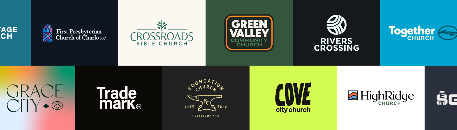
The Best Church Logos You’ve Never Seen Before
Welcome to a special showcase featuring some of the best church logos you've probably never seen before!
Now, you might be thinking that a great logo is the exclusive domain of large and affluent churches.
Think again.
I've curated a rich mix of logos that represent the broad tapestry of the church body—across denominations, from well-established congregations to brand-new church plants.
Here’s why:
Because a well-designed logo is like the face of a church—it's often the first thing people notice, and it leaves a lasting impression.
A great logo can articulate your church’s values, mission, and community, all without saying a word.
And let me give you a little teaser:
The final logo we're going to discuss is my personal favorite. The reason why might surprise you, but we'll get to that when we reach the end of our journey.
So, whether you're on the hunt for a new logo, considering a makeover for your current one, or just intrigued by the elements that make a church logo effective, get ready to be inspired.
Free Bonus: Church Logos Pack
I've packaged every single logo design and branding component that you're gonna see in this post into a download. Click below to download it!
Solid Ground Church
📍Lewes, DE | Solidground.church

Story Behind the Logo: In Dewey Beach, Delaware (just down the road from this church) are these unique architectural towers anchored into the ground. As you can see in the reference image, Solid Ground Church reflected the shape of those towers in the mark.
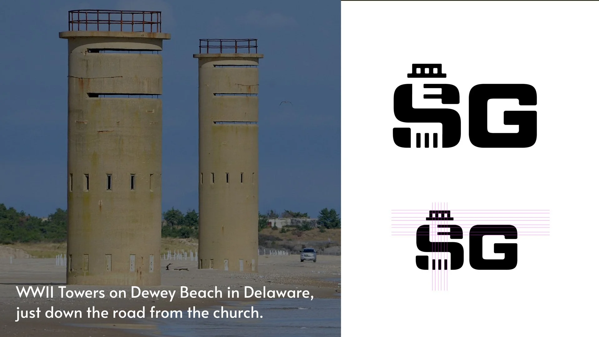
They created this strong geographical nod to the community the church serves in, while also referencing Jesus in the Gospels - that a life built with God is one built on a strong foundation.
And what's cool about those towers in Dewey Beach is that they've been there for more than 70 years. So just like residents of Delaware have swam at the beaches where these towers preside for their entire lives, so too is God always present in our own lives, watching over us for whatever life's next wave might be.
Just a ton of great meaning and depth to this logo design!
Color Choice: They chose colors that would reflect their brand targets of earthy, local, outdoor, and stable. Even the names of the colors evoke the feelings of those targets: "woods," "copper," and "morning fog". The colors and color names make the brand feel grounded and stable.
Font Choice: As if that’s not enough, they chose the beautiful font Garamond, weighted in Semibold paired with Alata - such a clean and familiar combination without being boring.

Bonus: Now, this isn’t one of the church's brand targets, but I can’t help but feel sophistication exuding from this logo because sometimes when I give it a quick glance, it looks like the letter “S” is wearing a top hat…is that just me?
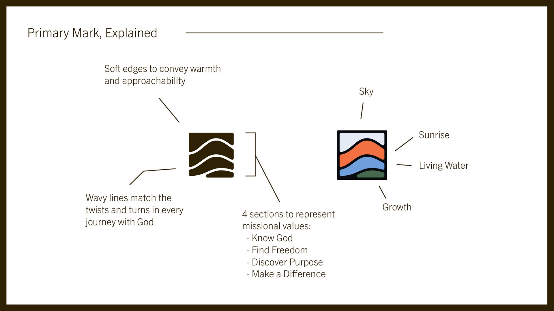
HighRidge Church
📍Fortworth, TX | highridgechurch.com

Story Behind the Logo: The logo reflects the church's four missional values:
Know God
Find Freedom
Discover Purpose
Make a Difference
Each section of the logo is a representation of these values. The soft edges are meant to convey warmth and approachability, the kind of community of believers this church aspires to be known as. The wavy lines are there to match the twists and turns of life as we journey with God.
Color Choice: I'm personally such a sucker for green, that's my favorite color, and this shade paired with the beige is very nice.
Font Choice: Franklin Gothic is the go-to for the headings and Trade Gothic for copy.
Think about this:
Does your logo still work when the color is gone?
This is so important to consider when creating a logo and something I find a lot of churches struggle with. HighRidge does a great job of showing how its branding can work when it's monochromatic because it will most definitely show up that way at times.
Make sure to do a B&W check on your logo to make sure it’s still clean, and clear, and no information is lacking when it’s without color.

Next one, and this one’s crazy…
First Presbyterian Church of Charlotte
📍Charlotte, NC | firstpres-charlotte.org

Story Behind the Logo: This church's logo takes the city grid of Charlotte and employs it in the lines of the stained glass! The church said it this way:
"Our church is 200 years old, and our next-door neighbors are skyscrapers. We love this city. We are honored to be located in the heart of Charlotte where we can offer love, support, and meals to those in need."
Talk about creative and intentional. You’re not gonna catch that nuance at first glance, but that’s the kind of thing that really makes a logo sparkle.
Color Choice: The color palette is what makes the stained glass move from traditional and possibly dated to modern and fresh.
Wait for it…there’s one more cool Easter Egg, if you can call it that, about this church's brand colors. They are an homage to the colors of a couple of the sports franchises in Charlotte, namely the Charlotte Hornets, with their purple and blue colors.

Font Choice: They chose Masqualero Bold Italic - a regal serif font that lends itself well to their centuries-old legacy as a church, then pair it with Avenir, which is more modern and clean. Another great combination.
Bonus: If you are an older church with a strong history and you want to honor that, but you also know you can't live in the past and want to chart the next chapter for your church, I can't think of a better example than First Presbyterian when it comes to the execution of that aspiration.
Next up we have…
The Church At CW
📍Harpersville, AL | thechurchatcw.com

Story Behind the Logo: The logo for The Church At CW is a great case study in logo refreshing. As you can see, the upper half of the circle is where you’ve got the “C” and the bottom half shapes the “W”. They have a cross in the middle representing Jesus at the center of His church.
If you notice in the reference image, The Church At CW already had this logo but wanted to update and improve upon it by tweaking just a few small things through spacing and alignment.
By making just a few small tweaks, the logo reads clearer and communicates more effectively.

Bonus: If your church already has a logo but needs an update, take a page out of The Church At CW’s design playbook. It’s a great example for churches looking to refresh their existing logos without a full re-design.
Reach City Church
📍North Chesterfield, VA | reachcity.tv
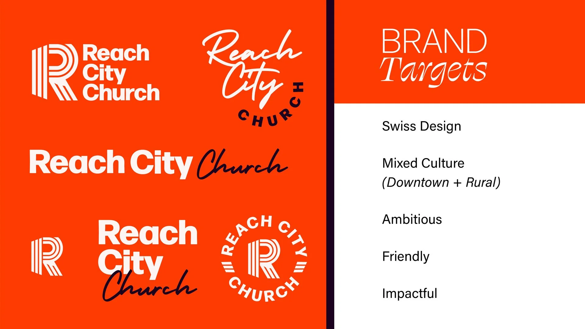
Story Behind the Logo: Here we've got the “R” for Reach with two “C”s tucked into the letter “R” as well for City and Church.
If we examine the brand targets for Reach City, we see Swiss design, which I thought was a really cool and very specific target. And this is a great takeaway for successfully redoing your own church's logo and brand.
The more specific you can get with your creative vision, the more likely you are to have a successful rebrand.
And this is also a great example of a church with multiple demographics in their community of believers - a mix of urban and rural.
Color Choice: The colors are chosen to be ambitious, friendly, and impactful.
Font Choice: For me, this is my favorite thing about this brand. We've got Forma DJR, which is an Adobe font (and I don't think I've ever used that font before), but look at how great it displays in both the Black weight and the Light weight! And then we've got Swear Display in the Cilati weight. Here, we're seeing the “ambitious” brand target embodied in that font.
Finally, a third font is used for copy in this brand family - the font Acumin.
No doubt about it, Forma DJR and Swear Display provide a unique visual language for the brand.

Bonus: If you're wondering, "What is a Cilati weight, and did I even pronounce that right?" Well, I'm not sure about the pronunciation, but the word Cilati is…well, it's just Italic backward. So, in my book, take a couple of points away from Swear Display for that because it’s just criminal.
Bold Church
📍San Jose, CA | bold.church

Story Behind the Logo: This church wanted a logo that was as unabashed as their church is. And again, that's an important principle in logo design.
How does your visual brand represent and express the unique DNA of your church?

It can't just look good. The best brands and logos also have genuine meaning.
And for Bold Church, it's in the name. They wanted something unignorable and disruptive but also offset by being a bit playful.
And I think in church brands, we're often trying to thread the needle of two opposing ideas. We've seen that a lot so far in this list of church logos:
Modern with rich tradition.
Urban and rural.
Or in this case, disruptive and playful.
And here's the thing.
The Church at its best is a mixture of people that wouldn't likely cross paths in other parts of society, right? Different backgrounds, different ethnicities, different ages, varied socioeconomic classes. We are all equal and one in the body of Christ.
Do you know how often teenagers and seniors (who don’t share DNA) hang out in the same place?
It’s completely uncommon. But not in the church, and so this unique blend of different people united with a common purpose - that's what makes the fabric of the church unique in our culture.
And so it's also what can inspire novel creative expressions in logo design and branding.
And speaking of young people, let's move to a younger church now, located in Cleveland, Ohio…
Cove City Church
📍Cleveland, OH | covecitychurch.org

Story Behind the Logo: Cove City Church wanted a youthful and vibrant visual identity. So they leaned heavily into the right colors and fonts to accomplish this.
Color Choice: The highlighter green and purple color scheme is both fresh and energetic.
Font Choice: For headings and large text, the font this church chose was Calistoga, paired with the timeless Helvetica for smaller text and paragraph copy.
As it turns out, a logo can say exactly what it needs to just through color and font.
Antioch Church
📍Great Falls, Montana | antiochgf.church
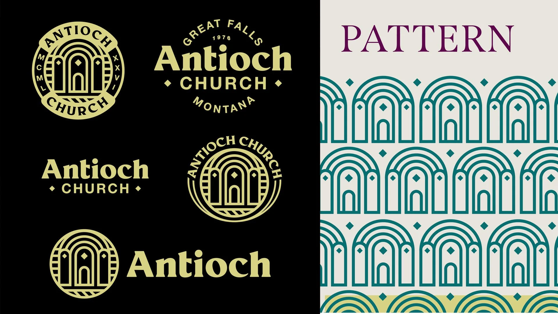
Story Behind the Logo: The centerpiece for this logo is pulled from the architecture of the original church at Antioch.
Font Choice: Span Regular serves as the heading and large text typeface while Helvetica and Neue Haas show up again for different options for body text.
As promised, I saved the best for last…
CFC Youth

Story Behind the Logo: Last but not least, we focus on a youth ministry, CFC Youth. Their logo, a refreshing change of pace, embodies the young spirit and enthusiasm of the ministry.
Why is it my favorite?
The answer: I was born in 1991, and if you look at the brand targets for CFC Youth, here's what you'll find: nostalgia, 90s, and Dutch Bros.
Now, I am not from the Western United States, so when I first saw Dutch Bros, I thought that was a reference to Old Dutch potato chips. Because look, does this not look like it's in the same family as CFC Youth?

I don’t believe these brands are related in any way yet, the branding is eerily similar.
Anyway, turn this logo into a sticker. Go to a youth convention. Stick ‘em on the backs of unsuspecting patrons from other youth groups. (I know a youth pastor that did that as a bit of “viral” marketing, back in the day.)
It might also help to know that my youth group was called Impact Youth and our logo was just the word Impact in, get this, Impact font. Cringe.
So maybe my standards are just low for what a youth group's brand can be but even look at this font - p22 Underground.
See the glyphs above the lowercase “J”s and “I”s?
They're diamonds! I mean, come on! That's delightful.

Color Choice: Bright and uplifting colors reflect the energy of the youth.
Font Choice: Along with p22 Underground, we've got p22 Mackinac for subheaders and Brandon Grotesque for copy which just may be my favorite font of all time even if it is quite common nowadays.
Just flawless execution in my books here with CFC Youth.
Who Made These Logos & Brands?
By now, I know you’re wondering, “Who is making all of these beautiful logos and brands?”
It's not me.
All of these logos were designed by Josh Whiting and his agency Bright Coal. To be abundantly clear, this is not a sponsored post. I am not an affiliate or anything like that with Bright Coal.
But Josh was kind enough to invite me on his podcast a little while back called "Making A Mark." And when I was checking out his website for the first time preparing for the show, I was really impressed by his work.
And I thought to myself, "More people need to see this."
If your church is looking toward a rebrand or needs a logo designed, I would certainly recommend Bright Coal.
Free Bonus: Church Logos Pack
I've packaged every single logo design and branding component that you're gonna see in this post into a download. Click below to download it!
Conclusion
No doubt about it, church logos are more than mere visuals; they are the embodiment of the church’s values, missions, and community spirit.
Knowing the story behind each design enriches our understanding and appreciation for these unique symbols of faith.
More Posts