The Best Church Branding You’ve Never Seen
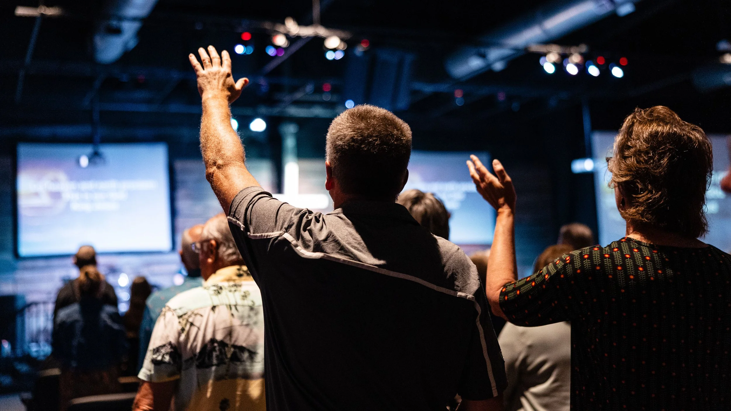
In the ever-evolving landscape of church communications, it's rare to stumble upon something that truly stops you in your tracks.
Yet, that's precisely what happened a few weeks ago when one of you kind individuals shared a piece of church branding with me that was nothing short of revelatory.
It wasn't just good; it was, without exaggeration, the best example of church branding I've had the pleasure of encountering in a very long time.
There's something deeply exhilarating about uncovering exceptional branding in the church space.
It goes beyond aesthetics; it's about discovering a connection, a message, and a mission encapsulated so perfectly that it resonates on a profound level.
That's why I'm thrilled to discuss what I saw and the essence of what makes a great brand genuinely great.
Free Bonus: Church Logos Pack
I've packaged a special showcase featuring some of the best church logos you've probably never seen before. Click below to download it!
So, without further ado, let’s explore the elements that elevate this church’s brand from ordinary to extraordinary.
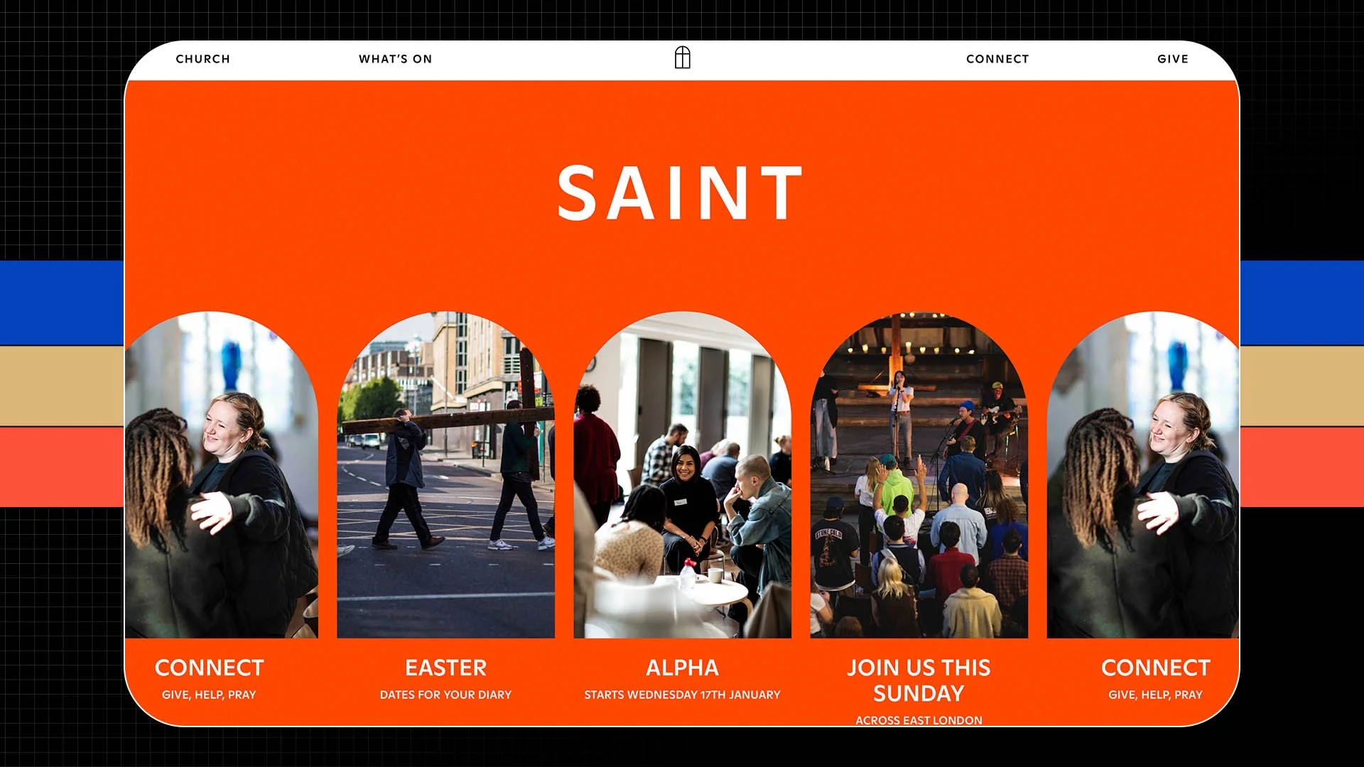
Saint Church in London, England
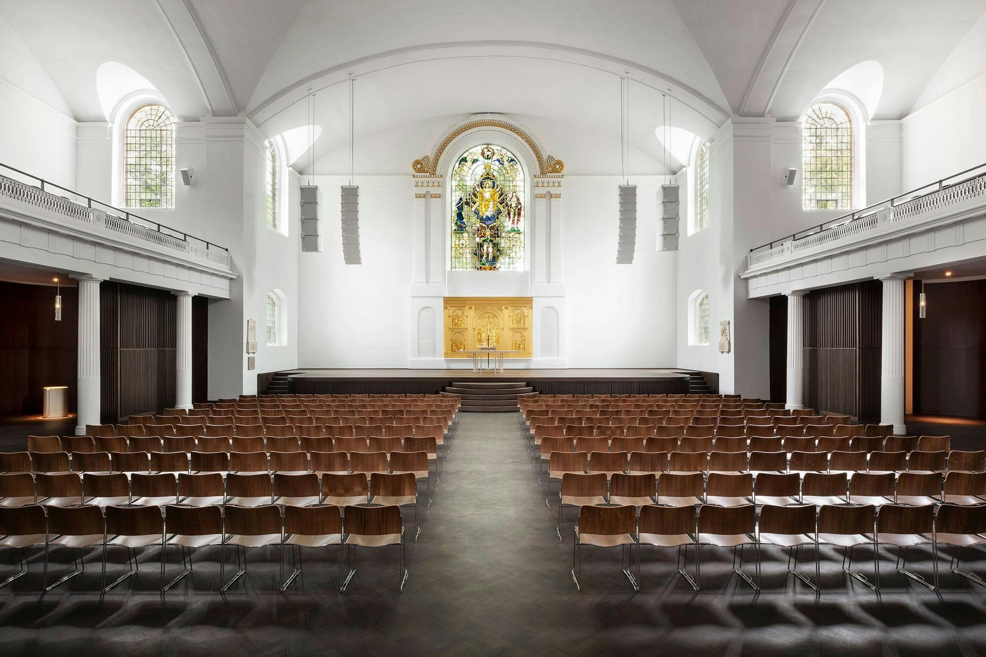
This is Saint Church in London, England (formerly Hackney Church).
The branding was done by Omse, a creative agency also in London.
Now, what prompted this church's rebranding project was that their building was undergoing a massive restoration.
A bit of history on the church:
St. John at Hackney is an iconic Anglican parish church in the London borough of Hackney.
It has a large capacity of around 2,000 people and was built in 1792 to replace Hackney's medieval parish church, which goes all the way back to 1275.
So, obviously, there is a ton of history here.
Not only is this a thriving church, but the building is also a music venue, playing host to Coldplay, Ed Sheeran, and Interpol.
And the fact that this church building also operates as a music venue is important - but just hold that thought for a moment.
Back to the restoration project.
Here's a quote directly from the church:
"To facilitate our ambitious vision, Saint has just completed a once-in-a-lifetime restoration of Hackney Church and its surrounding churchyard. This £6 million project has turned this iconic building into a world-class music and events venue, with thanks to lottery funding. The space is designed to be a cathedral of creativity for church, music, and unique experiences. Hackney Church is one of the largest venues in East London."
And if you're curious what "lottery" funding means in this context - there's a badge on the church's website that says "made possible with Heritage Fund."
The Heritage Fund - full name The National Lottery Heritage Fund - was started in the mid-90s, and what it does is distribute a share of National Lottery funding to support heritage projects across the United Kingdom.
So this church's building, as historic as it is, qualified for this reno through this fund.
Pretty cool.
And reportedly, according to Wikipedia, about 2 million pounds of the overall budget came from the lottery fund.
Branding Begins:
Once the restoration project of the building was in motion, the rebranding project also began to take shape.
The inspiration for this church’s new branding came from the stained glass windows in their building.
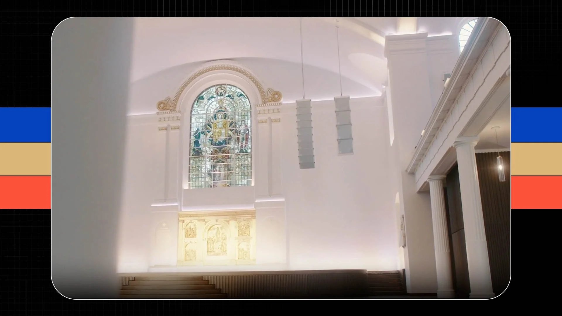
Here's how Omse, the creative agency behind the branding, describes it:
"First, we designed a core symbol, taking inspiration from the building’s large stained-glass windows. But they’re not only a church – they’re also a gig venue, brewery, charity & apiary. So we also developed a series of symbols to introduce each area of work."
This is where we get into some really cool concepts.
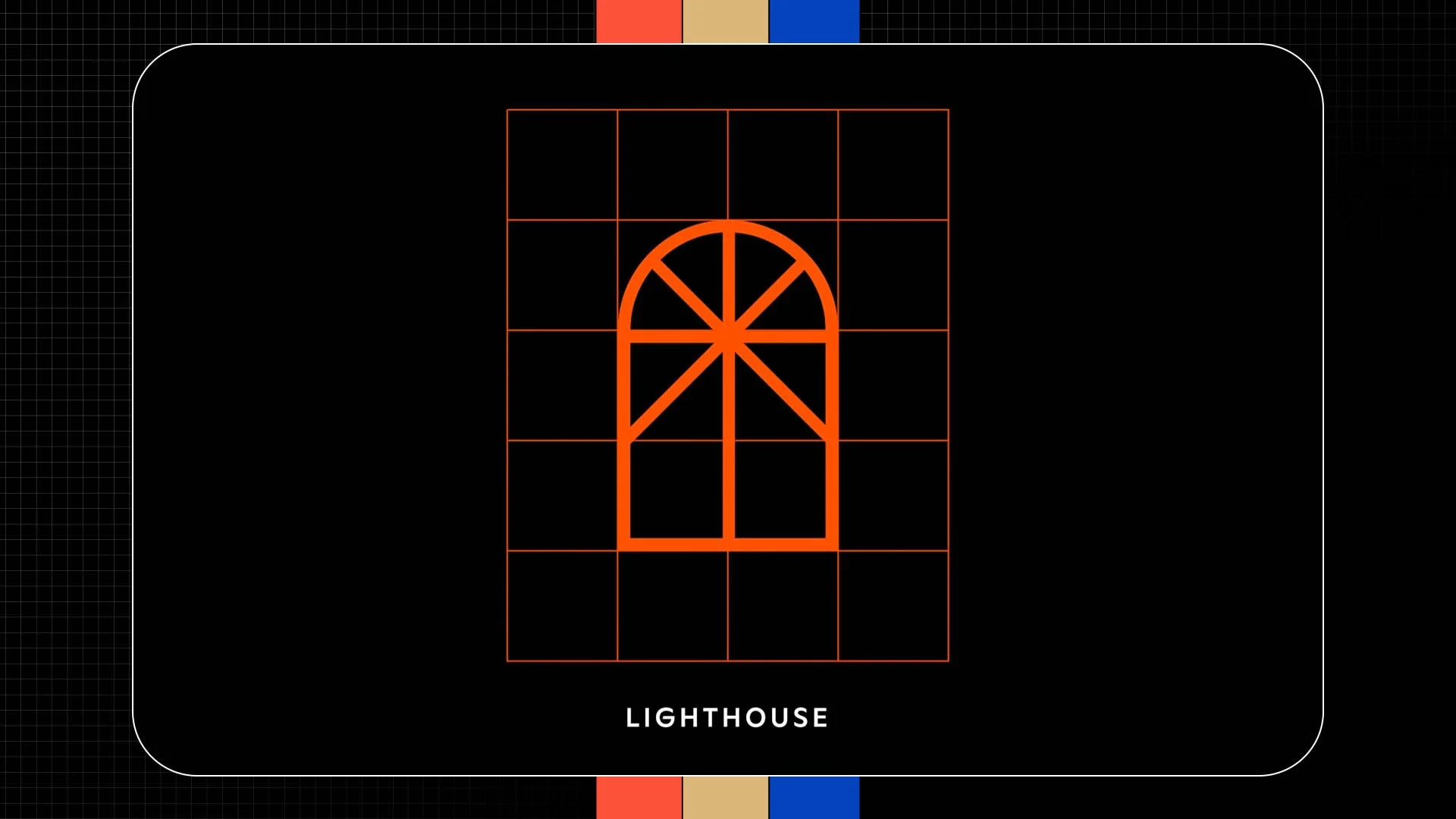
The logo mark starts with the arched window outline and is combined with a cross.
That becomes the primary logo mark for the church.

Then there are variations with different symbols for each of the church's other branches.
The Bakery
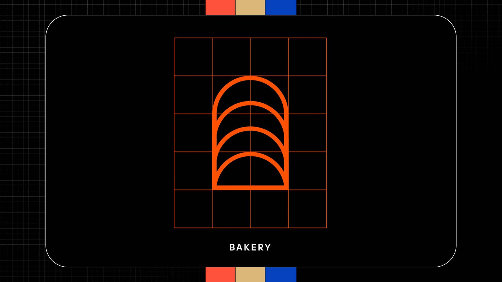
Bees

Brewery

Lighthouse
Then, Omse took that same window outline and used it as a frame for different applications throughout the church—for example, stickers on cans.

Check out the back of this one can. You can see it says Hackney Church Brew Co.
Very cool.
This same window outline was used as frames for photos.

You can see that here at the top of their revamped website.
Also, name tags for volunteers.

And even an arch for text.
You can also see it here in signage.

Wanna turn it into a necklace? Why not? They've got that also.
Free Bonus: Church Logos Pack
I've packaged a special showcase featuring some of the best church logos you've probably never seen before. Click below to download it!
So Here’s What I Love:
What I love about this brand is that there's historic rooting in this outline, from the stained glass windows in this church's building that date back hundreds of years.
But they're bringing it into a modern context, which is obviously outrageously challenging.
How do you keep the reverence and heritage of something so unique and rooted in the community while recognizing the biggest communication shift in 500 years?
How can those two intersect in a meaningful way that honors the past while also plotting a clear trajectory forward?
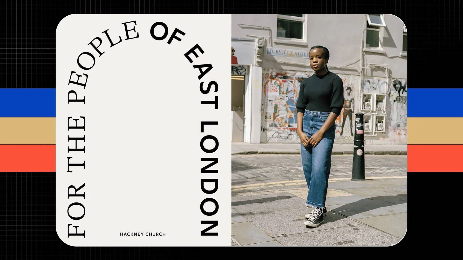
Taking this window outline and using that as the frame for a myriad of different creative and visual expressions across the church's online and in-person identities is a constant reminder of where this church has come from, which also projects hope and vision for what's next.
But it doesn't stop there.
Once the foundation of the brand identity was established, Omse then got to work to build on this vision for the kids and families of East London that SAINT Church serves.
Another quote from the London-based creative agency:
"We created unique identities for weekly programs that invites kids to explore faith or play games, and initiatives such as clothes and toy swaps and coffee mornings for the adults."
And what that led to were these immensely cool illustrations for the kids' ministry.

You can still see the frame outline in various ways here, often as a secondary visual piece or playing the background.
But what I love about this side of the branding project was they translated the brand to be playful because it makes sense in this context of children's ministry.
Let's plot this out for a moment.
> You've got an English church dating back to Medieval Times + a building marked as a grade II historic structure in the UK
(It doesn't get much more stuffy than that.)
> This church desires to modernize. So they take this ancient heritage and freshen it up.
> They then apply that same new brand's principles and visual rules into literal cartoons.
Just imagine with me for a moment if you cast this vision in a staff meeting…
You: "Yeah, we're gonna take the church's heritage -”
Co-Worker: "Oh, and how far back are we talking?"
You: “Oh, you know, how far back does this church go?”
Co-Worker: “You know Genghis Khan?”
You: “Ok, so it's pretty far back, yeah, but don't worry, we're gonna honor the history - buuuuuut, I should probably tell you….there will be cartoons."
When you describe it like that, it sounds comical, pun intended, yet they pull it off magnificently well.
And here's what the creative director of Omse said about this:
“We’d like the brand to continue to develop over time and are interested in new ways to reference the window shape. The key parameters [of the brand] focus on [utilizing] imagery, illustration or photography as the key differentiator(s)...which changes depending on their intended audience."
That final line is the key.
The brand transforms based on its intended audience.
The hallmark of great branding.
Not inwardly focused.
But rooted in an identity that can then be shaped to meet the people it's trying to reach where they are.
Curious About Fonts?
Across the entire brand, GT Alpina, a Roman serif drawn by Grilli Type, is being used.
And then Dinamo’s sans-serif Ginto was used for the Church’s youth programs.
Again, quoting the creative director of OMSE,
“to give these programs a bit more edge and energy."
Once again, contextualizing the brand to its audience.
Free Bonus: Church Logos Pack
I've packaged a special showcase featuring some of the best church logos you've probably never seen before. Click below to download it!
Conclusion
If you are in the London area, this might be a great weekend outing.
Check out this church in person and see the building redesign and the new branding in action.
And true to the form of a modern church, you can find a Plan Your Visit page on this church's new website with notes about public transport, parking, accessibility, and contact info.
Also included are the address, service times, and what to expect in the form of a service order.
Now, I know this isn't a blog dedicated to church websites, but this is crucial information, folks.
And look how it's displayed here, nothing too crazy.
Just black text on a white background.
Neatly formatted.
Accordion dropdowns so the text doesn't get too long.
This kind of thing really does make a huge difference.
But what do you think?
I want to hear from you. What are your thoughts on this church’s rebrand?
You can go to Saint.church if you want to see more.
And make sure to check out the branding agency behind this project as well.
They're on Instagram @omse.co.
You can also check out their website to explore other projects they've worked on -omse.co
As for the blog, you should read next? One of my favorites - The Best Church Logos You've Never Seen Before.
Thanks as always for your time, attention, and trust.
And we'll talk real soon.
More Posts