My Favorite Church Design Trends [Spring 2024]
A new design trend is bothering me. I think it'll bother you, too.
But there are also several Spring design trends this year that I'm finding delightful!
Let's start with the nasty one, though - watch this:
The New Unsplash MOV:
"Stock imagery that doesn't look at all like stock."
Sound familiar to anyone?
THAT WAS THE WHOLE POINT OF UNSPLASH.
What’s so fascinating about this is my generation, Millennials, loved Unsplash because it felt genuine - when iStock and Getty images did not.
For Gen Z, however, stock photos shot on phones are what feels genuine.
Unsplash does not.
The intention is the same, though, right?
Both groups want their creative expression to feel genuine to them.
This is the inescapable truth every creative needs to keep in mind:
Creative expression might be about personal preference on the surface, but at its core, every creative choice communicates a deeply held value.
This is one of the primary challenges of church creativity because what do you do when one generation says a creative expression looks fake while the other says it's authentic?
That's not a problem to solve, but a tension to manage.
The first step is being aware that it's happening around you.
The other thing you need to be mindful of (and the part of this design trend that's bothering me) is the acceleration of trend turnover, which is increasing considerably.
You hear what that woman said in the video? "It's not 2018 anymore."
She made 2018 sound like 1998.
From a purely aesthetic standpoint, it's really interesting because what I loved about Unsplash when it first debuted was the texture and cinematic element of the photos.
Unlike the overly glossy stock photos that were the norm then, you could tell Unsplash's photos were taken with DSLR cameras.
There was shallow depth of field, creative styling in the colors, and grain.
The irony, of course, is that what I perceived as desirable in a stock photo is precisely what Gen Z now sees as inauthentic and staged.
Generations have their own fashion, their own music, their own social platforms, and now their own stock photo aesthetics.
Let's swing to the other side of the design landscape now and talk about trends I enjoy.
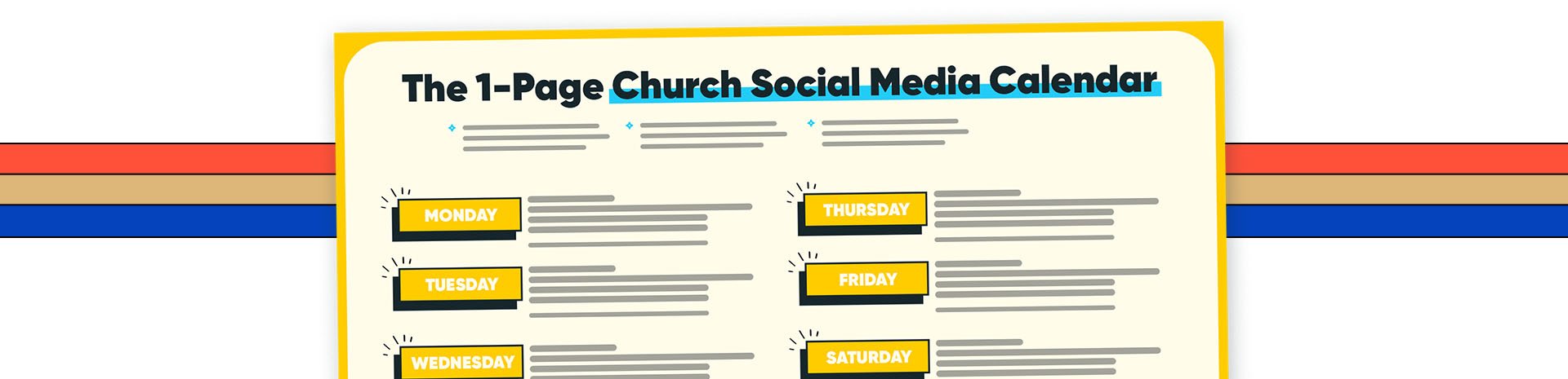
Free Bonus
The 1-Page Church Social Media Calendar: My detailed process for taking one sermon and turning it into a week’s worth of social media content for your church.
Spring 2024 Trends
If you're looking for social media trends for Spring, we did a podcast on The Pro Church Tools Show; the title of that episode is Spring 2024 Church Social Media Trends.
Take a moment and add it to your podcast player of choice so you can listen to it on your daily walk, in the gym, or while preparing dinner.
But as I mentioned at the beginning of this blog, today, I want to narrow our focus specifically on design trends.
Here are five design trends I can’t get enough of this Spring.
Trend #1: Chunky Fonts & Buttons
Holy Trinity in London and its website, htb.org, are a perfect example.
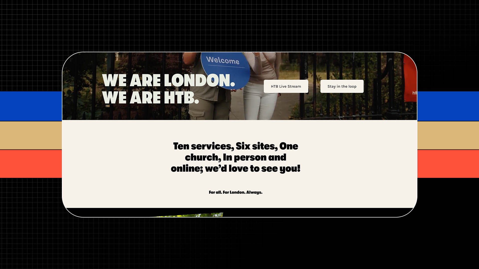
Thick type.
And even thicker buttons.
Specifically, if you visit this website on mobile, the buttons in the hero section are pretty tall.
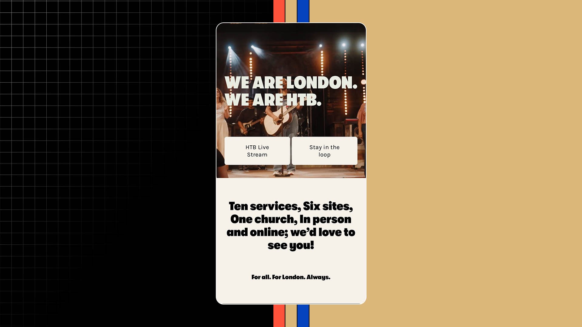
This isn't how you'll see buttons typically styled. But I'm here for it.
As for the font, HTB uses GT Walsheim in the weight Ultra Bold.

Now, I'm a real sicko for a thick font.
If you head to my Instagram @bradyshearer, you'll see the covers on my carousels are all high-contrast with thick type against plain backgrounds.

The font I use on these carousels is the Pro Church Tools brand is the font Neue Haas Grotestk in the Black weight.
But because I'm a menace, I actually made additional modifications to this typeface.
When a font isn't thick enough for me, I'll go into Photoshop and add an extra stroke, in this case about 5-10 pixels, depending on the size of the image, to make the font even thicker.

And if you're looking for other chunky font options, check out Humane V.2.0

And Thunder (which is a great free option).

#2. Mono Fonts
I don't care if this is the only way forward; this is a trend I will champion all by myself.
Here, you can see it in a church design.

This is a free mono font called DM Mono.
It's a Google Font.
When we redid the Pro Church Tools brand late last year, Ki Monospace was used as our mono font.

At the beginning of this year, we refreshed the Nucleus brand.

Nothing too crazy.
It's the same primary font for the brand. Same colors.
But I wanted to add a little kick, a little spice, and of course, the answer was a mono font.
For Nucleus, we went with Akkurat Mono.

And if you're curious, what is a mono font?
The name mono comes from the typeface's design because each character occupies the same amount of horizontal space.
Monospaced fonts were widely used in early computers. Also typewriters. And so they have a nostalgic feel.
I love using something that reminds people of decades past in modern designs.
That's fusion.
It's fun.
Moving to trend number three.
#3. Pop Of Color
This design trend is inspired by the fashion world.
The idea here is that for most people, our base outfits are comprised of neutral colors: black, white, greys, browns, navy, etc.
And one way to dip your foot into color in a way that you really can't mess up is to throw in one item with color - usually an accessory like a hat in warmer weather or a scarf in colder weather, or even sneakers that have a bold color.
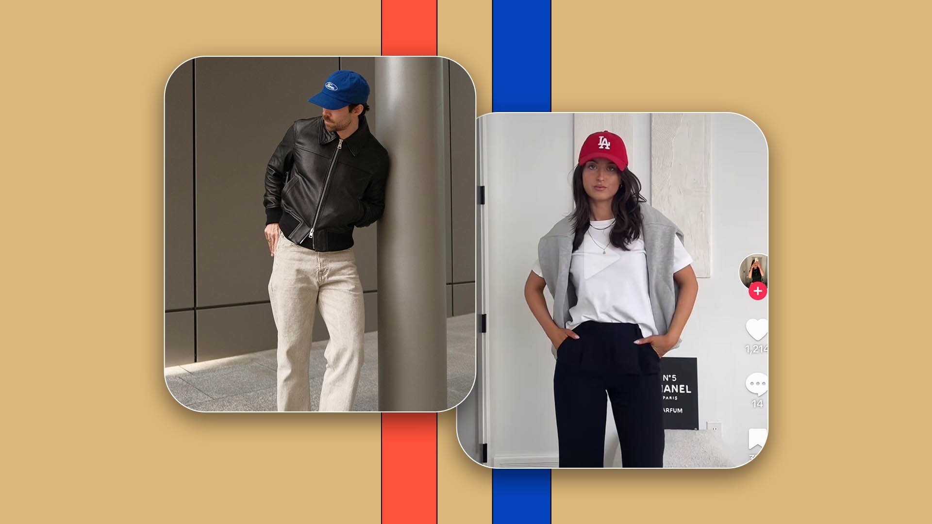
A ‘pop of color’.
In terms of how that translates to church designs, here's a website example I really like.

Again, it's a single, vibrant color here being used on buttons and banners against a neutral backbone.
The more vibrant the color, the better.
But remember, this is just to accessorize.
A pop of color.
Free Bonus
The 1-Page Church Social Media Calendar: My detailed process for taking one sermon and turning it into a week’s worth of social media content for your church.
#4. Yellow
Just the color yellow. Okay?
The haters are trying to take yellow from me.
Saying its time has come and gone.
It's all about icy blue now. That’s fine. You can keep your icy blue. I’m going to use yellow even harder.

The more electric, the better.

I want my yellow to look like a highlighter.
Bonus Trend:
Another trend I like that Reuben employs here in his designs is having one word in a design in a different font.

More often than not, I’m reaching for a curvy display font for this - and it NEEDS to be in italic weight.
That's just me.
Nyght Serif is a free option.
As for applications of this design trend, you see how Reuben does it on those Instagram posts.
As mentioned above, we also did it in the Nucleus brand refresh by having just one word in the curvy display font.

You can see the word "generation" here in the hero section.
We did it with the word "churches" on this page and here with the word "reviews."

So yes, it can be a trendy sermon series graphic where you're pushing the limit with design, but you can do it even on a website or in the brand itself!
I like using this trend to express emotion and emphasis through the type.

For us, the font we used was Domaine Display.
And now, trend number five.
#5. 90s Mascots
Perhaps the most specific of the trends, but popular nonetheless.

And I’m here for it!
Again, this is Gen Z bringing back the 90s. We appreciate their influence. Thank you for reminding me of my childhood.

Am I on board with the iPhone stock photos?
Look, I'm on a journey there.
But I'm very much supportive of this trend. The key is to get the correct font.

You need to pair it with a graffiti-style typeface.
I've got a few options for you here: Soap by Adobe. (If you already have an Adobe subscription, you'll have access to this font at no extra cost.)

Similarly, Cheee by Adobe is a good fit here. (I might like this one even more than Soap for this specific application.)
And then Getai Grotesk Display - which isn't the absolute perfect fit here if we're picking nits, but certainly acceptable.

The bonus here is that this font is free even if you don't have an Adobe subscription.
Conclusion
Which of these design trends is your favorite?
Is there one you don't particularly care about?
Like me and the iPhone stock photos.
Let me know in the comments!
I would love to hear your voice on this. As for the next blog you should read, if you want even more Spring 2024 Trends, check out this one: Spring 2024 Church Social Media Trends.
Thanks as always for your time, attention, and trust - we’ll talk again next week.
Free Bonus
The 1-Page Church Social Media Calendar: My detailed process for taking one sermon and turning it into a week’s worth of social media content for your church.
More Posts