Churches Are Still Doing This On Social Media...
In the fast-paced world of social media, staying relevant is a constant challenge.
But what if I told you that many churches are unknowingly stuck in a time capsule, designing content for an era that ended years ago?
Simply put, the landscape of social media has evolved.
So in this post, I’ll cover:
The shift from The Social Graph Era to The Discovery Era
Why clinging to outdated design approaches can hinder impact
3 reasons why churches should embrace full-screen designs
Are you ready to bring your church's social media out of the past and into a current, more effective approach?
Let’s dive in.
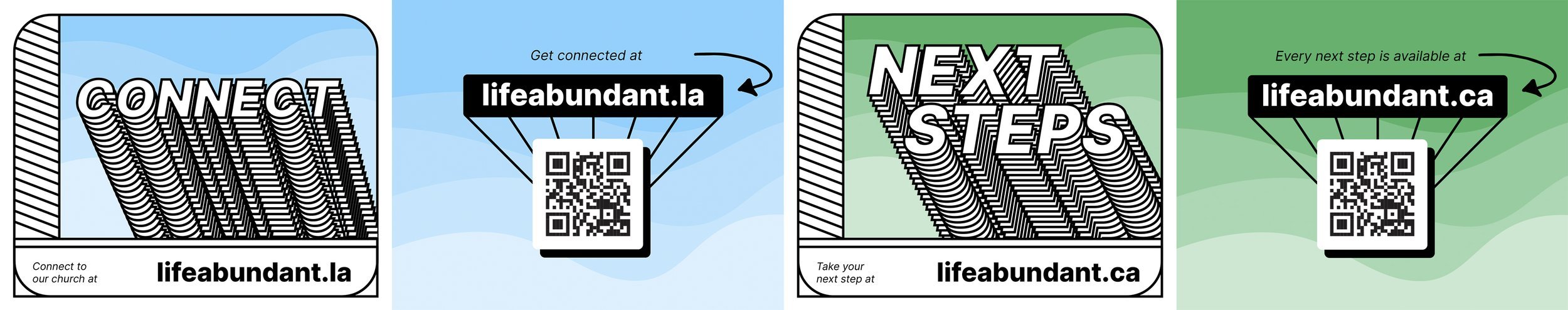
Free Bonus: Connect Card Template
Click the button below to download a full series of print-ready connect card templates.
Download Print-Ready Templates
The Social Graph Era vs. The Discovery Era
Back in 2018, I urged churches to embrace a simple mantra: Stop The Scroll. Has my advice changed at all? No. But how we go about achieving this objective is different.
To better understand this, let’s take a quick trip back in time.
It's 2018, and Instagram has just bid farewell to its chronological algorithm(1). Visual variety reigns supreme, and churches are navigating a world dominated by still images with fixed aspect ratios of 1:1 and 4:5.
Most of us were confident in our social media design strategy.
What we didn’t know at that time in 2018 is that we were very close to the first era of social media coming to an end - The Social Graph Era.
The Social Graph Era began on September 5th, 2006 - the day Facebook opened its doors to the public. This era was characterized by organic content from your social connections, shaping your "social graph."
This is when the infamous "like" button changed the world forever.

FB Feed in 2006 (2)
This era of social media was going along fine until it was disrupted. By who? The kids! Gen Z had found a new app to call their own, TikTok, and it was growing rapidly.
I like to think of social media in our society like music and fashion. It's a form of creative expression, it's culturally significant, and every generation does it a bit differently.
The Social Graph Era ended on August 5th, 2020 - the day Instagram announced Reels. (3) This is when The Social Graph Era ended and The Discovery Era began.

To be clear, these dates are somewhat arbitrary. But they do mark watershed events because Instagram announcing Reels was a clear sign that Gen Z had embraced TikTok.
At this point, Meta has found themselves in a difficult spot. You know the old saying, “If you can't beat 'em, join 'em.’” Well, that’s exactly what they did.
First, it was Instagram, then Facebook, then eventually YouTube and Twitter as well.
What started with a change in the Instagram algorithm in 2018 escalated in a couple of years to an entirely new era of social media.
Where your feeds were once populated with content from your social graph (your friends and family), now it was all about your personal interests and viewing habits - enter, The Discovery Era.
It wasn't just the algorithms that had changed, the content containers we were used to were also new.
Instead of 1:1 and 4:5 aspect ratios, content was now a fully vertical 9:16 ratio, taking up our entire screens.
What Does This Mean For Your Church?
Here’s the problem:
Churches are still designing and publishing content in 2023 for The Social Graph Era, an era that ended years ago.
If this was just a stylistic preference, there would be no issue. However, designing your content for the current era will drastically impact your post’s performance.
Let’s take a look at Life.Church as an example (see below).
Life.Church is one of the biggest churches in the world, so this isn’t meant as shade to them (or any other churches).
Looking at these posts side-by-side is one of the best ways I can illustrate the stark difference between The Social Graph and The Discovery Era designs.
Both posts below are from this year. The first one (left) represents The Social Graph Era. The second one (right) represents The Discovery Era.
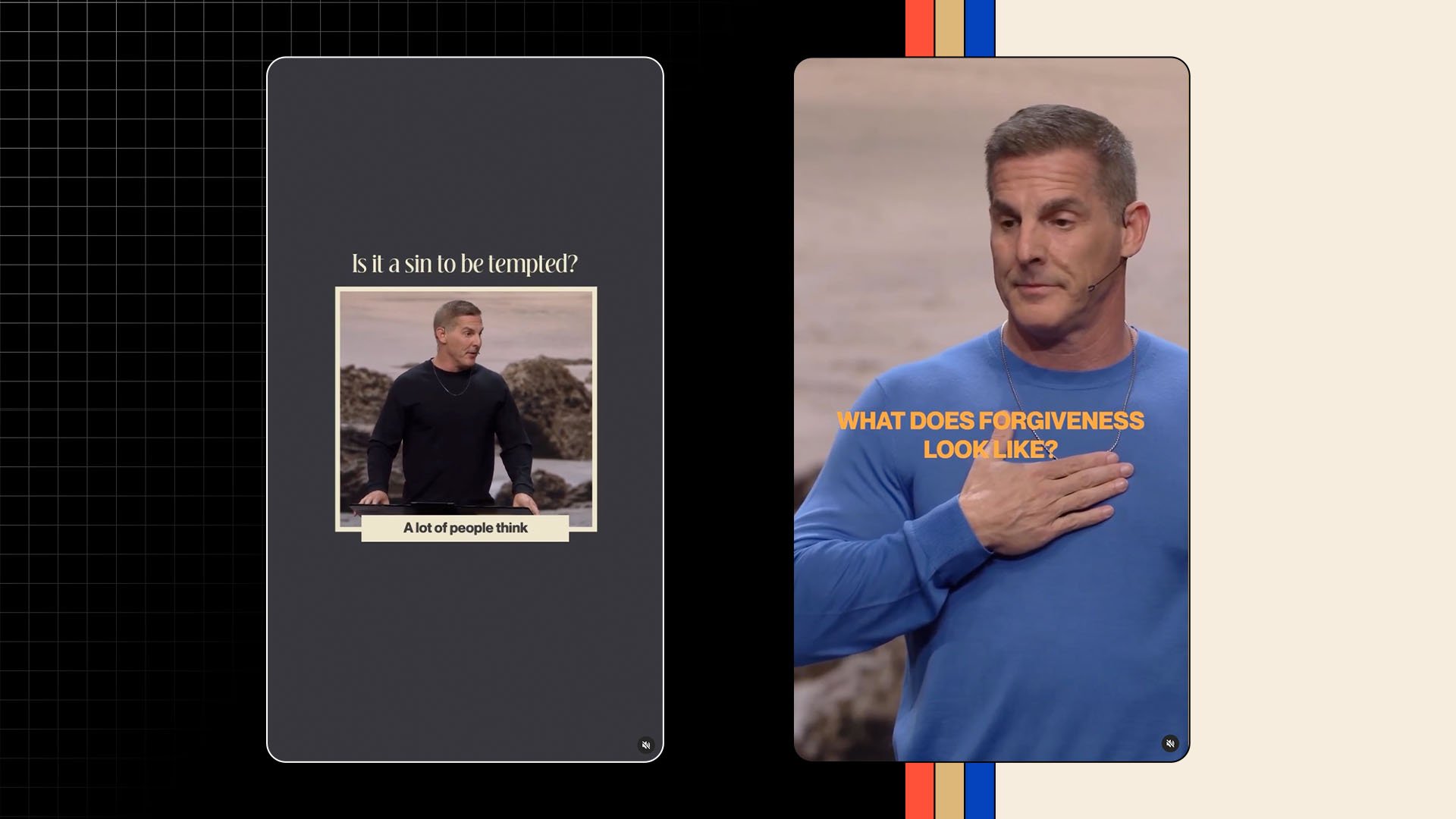
Can you spot the important difference? 👆
The first post is designed with a 4:5 aspect ratio in mind. The second post is designed in a 9:16 (vertical) aspect ratio.
Moreover, the first post has a more elaborate design. While the second is simply sermon footage full-screen. The differences may seem inconsequential, but they can meaningfully affect the performance of your posts.
Here’s why…
Why Our Churches Need To Embrace Full-Screen Design On Social
1. Proximity and Intimacy
When you shrink your pastor down on a vertical canvas, you are creating more distance between them and your audience. You're intentionally placing the pastor farther away by making them smaller.
Why does this matter? Because:
Shrinking your pastor down on a vertical canvas creates unnecessary distance between the message and the audience.
For comparison, we would never do something like this in live production.
Think about the biggest auditoriums or churches you've been in when someone is speaking onstage. What are the cameras doing? They're tight on the speaker so that no matter where you are in the room, you feel close in proximity to the preacher.
Why? Because if you feel distant from them physically, you'll feel distant from what they're trying to say.
Podcast clips are a great reference point for our sermon clips. The host and the guests are full screen because it creates an immersive experience. The full frame is being used, and what is the result? Well, that leads to my second reason for ditching the elaborate graphics and designs…
2. Human Connection
When we eliminate the extra design elements and bring the speaker in full screen, it feels more human because it’s less polished.
If you're looking for a pastor to emulate here, check out Judah Smith's sermon clips. Just a pastor preaching with full screen and simple captions.
It’s easy. It’s effective. It’s human.

3. Unique Advantage
The third reason I'm encouraging you to embrace full-screen designs is the unique advantage that churches have through our weekly sermons.
Think about it this way, most of the content you'll see on social media is set up in a way that there's a subconscious recognition on the part of the audience that what they're watching is premeditated. Most social content looks like this:
There’s flattering lighting
The creator knows what they want to say
And they’re talking directly to the camera
This is why some of the most effective content is any kind of video that captures something real and not staged. For example, people asking questions on the street, reaction videos, or live events.
And I don't think churches grasp just how powerful it is that we have a live event where a preacher is sharing a message with a real group of people – every week.
This fly-on-the-wall point of view is something people really enjoy. There's just one caveat…
You can't overproduce your sermon videos, or it eliminates the organic feeling altogether.
So when you start adding fancy graphics and overlays, and especially when you shrink the size of the preacher, people will immediately lose the feeling that they're stepping into something real.
Don’t strip away the unique advantage you have as a church. It's hurting the effectiveness of the post!
Now, if your church is passionate about elaborate designs because of the aesthetic or how neat your profile feed looks – that's your call. But my angle on this is always effectiveness.
Mission Over Method
My mission as a communicator in the church is not to create the coolest designs, it's to share The Good News on digital media with my local community of believers and to the ends of the Earth.
If my designs are playing a part in achieving that objective, excellent! But if they're getting in the way, as beautiful as they might be, I feel it's my responsibility to ditch them – even if it's difficult.
In 2018, these design efforts served a very important purpose. But they're not stopping the scroll anymore. There’s good news for churches, though. We have the content that can stop the scroll.
We just have to embrace the new era and say goodbye to the designs of the past.
Conclusion
So, here are the main takeaways:
Stop designing content for The Social Graph Era
Embrace the simplicity and the full-screen view of The Discovery Era
Focus on the mission over the method
Make these shifts in your social media strategy and see the impact that comes as a result.
Free Bonus: Connect Card Template
Click the button below to download a full series of print-ready connect card templates.
Download Print-Ready Templates
More Posts